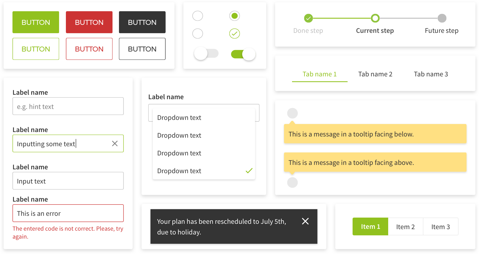
The HelloFresh Design System was a design system for HelloFresh web applications. I worked on it in 2018 with the consumer design team and engineering, helping turn shared product and brand decisions into something teams could use consistently across web experiences.
The idea came from a practical problem we had: HelloFresh was growing quickly, and maintaining a consistent experience across different web applications and teams was becoming increasingly important. Different teams were often solving similar interface problems in different ways. Buttons, forms, cards, tabs, labels, icons, spacing, and responsive behavior could drift from one application to another, even when everyone was trying to follow the same brand direction.
Back in 2018, there were already design systems we could learn from, but connecting design guidelines, engineering implementation, documentation, and adoption across multiple teams was still a relatively new way of working for us.
The design team had already been thinking about a style guide, but the real shift happened when design and engineering started working together on the system as a shared product. The goal was not just to make a Sketch library. We needed something that product teams could actually install, render, test, document, and ship.
The first implementation included a React component library, shared theme foundations, icons, documentation, tests, and a Storybook workspace where teams could inspect and discuss components outside of any single product.
Technical things
A style guide could describe what a component should look like, but a design system also had to answer how that component behaved in real product code. What happened when a button was disabled? How should spacing respond across breakpoints? How could teams extend components without breaking the system? How did we make sure server-side rendered applications received the generated CSS? How did icons move from design files into something engineers could actually use?
The codebase was structured as a monorepo managed with Lerna, with different packages covering the component library, shared theming and responsive utilities, icons, and development and testing tools.
The styling layer used Fela through react-fela, which meant components could be defined using rule functions that received the active theme. That gave us a clean way to keep design decisions centralized while still allowing components to change based on things like variants, sizes, states, and layout requirements.
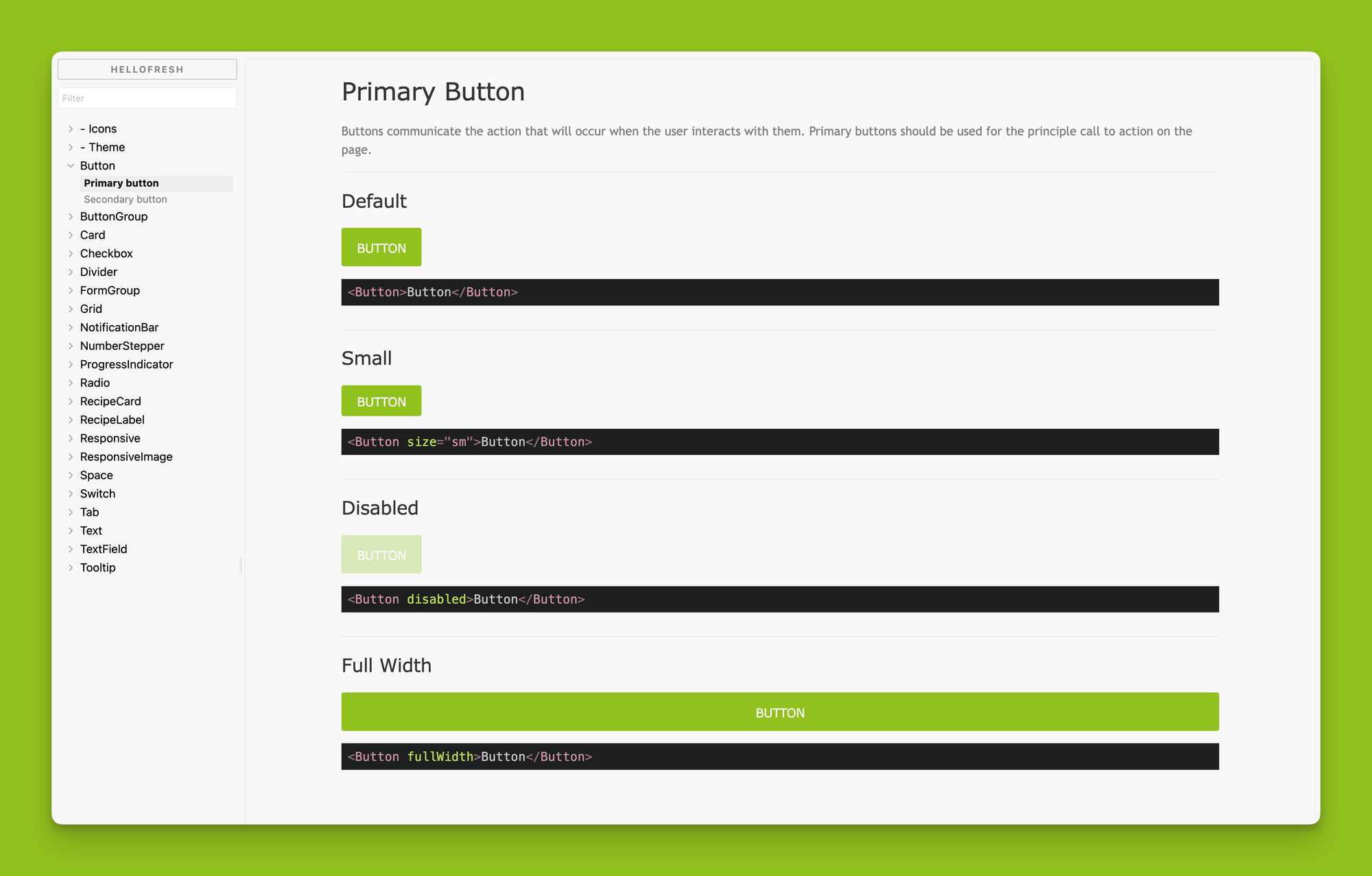
For example, a button did not just copy CSS from a mockup. It encoded the design decisions behind it: primary and secondary variants, theme colors, focus and hover states, spacing, border radius, typography, disabled behavior, and full-width support. The idea was to make the correct thing easy to use, so product teams did not have to rebuild those decisions every time.
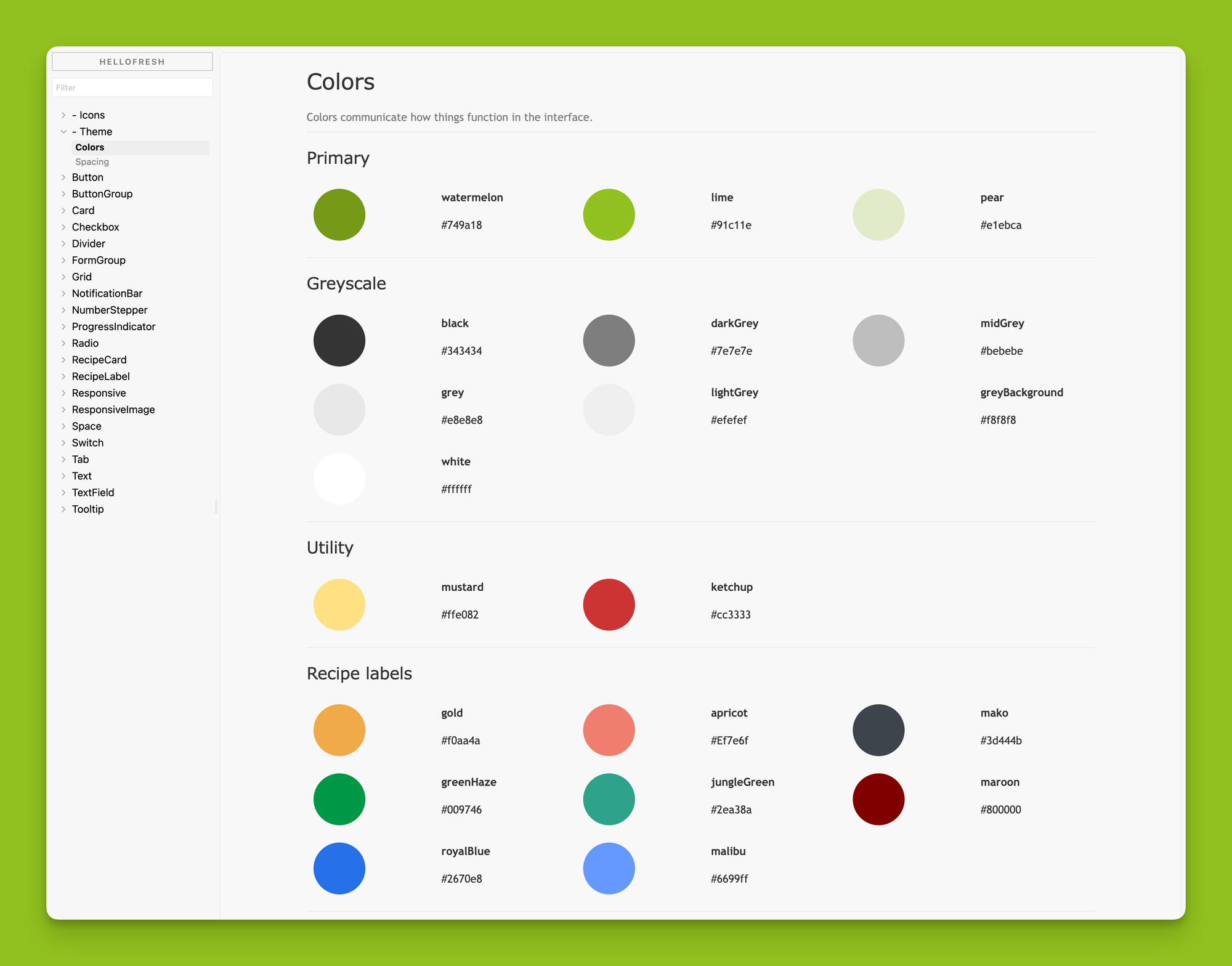
Storybook became the browser workspace for the system. It gave designers, engineers, and other people involved in the product a shared place to inspect components outside of any single application. It was useful not only for development, but also for discussing how components should behave before they reached a product.
One of the trickier parts was making the system fit into existing HelloFresh applications rather than assuming every app would be rebuilt around it. Teams needed to be able to adopt it incrementally while still getting the benefits of the shared theme and components. Supporting existing server-side rendered applications was part of that work as well.
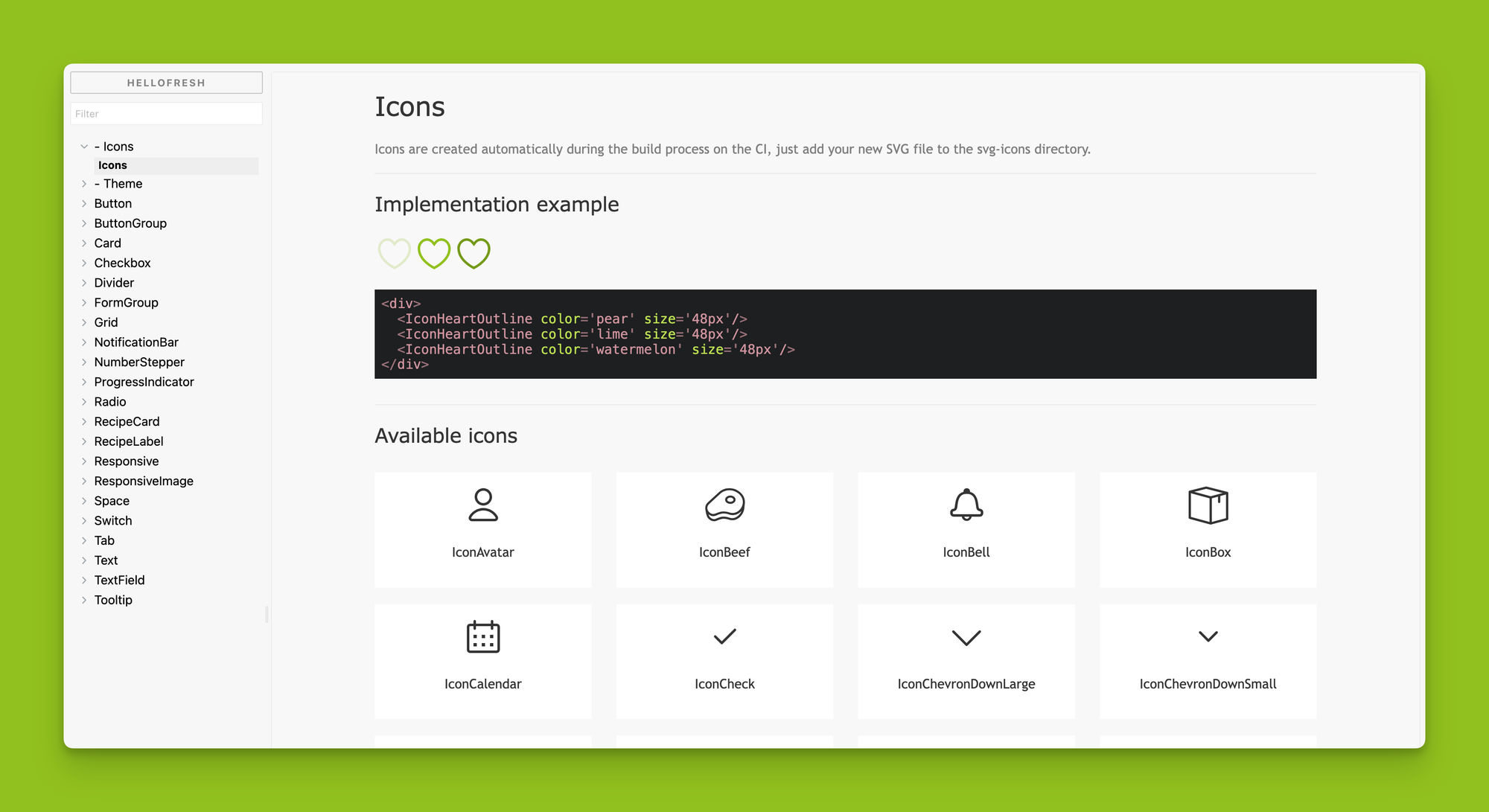
Icons followed a similar approach. Instead of leaving every application to manage raw assets independently, we had a pipeline that took SVG assets and turned them into components that could be consumed in the same way as the rest of the system.
Lessons learned
Building the HelloFresh Design System pushed me to think about design systems not just as a collection of UI pieces, but also as infrastructure.
The hard part was creating a shared language between design and engineering that could survive real product pressure. A good component needed to represent visual decisions, accessibility states, responsive behavior, implementation details, and documentation all at once.
It also made the boundary between flexibility and consistency very clear. If the system was too strict, teams would work around it. If it was too loose, it would stop creating consistency. Things like theme variants, responsive utilities, polymorphic components, and controlled extension points gave teams some room without making every implementation another one-off.
Documentation was also a crucial part of the product. A component library without usage guidance still left too much interpretation to every team. The documentation, Storybook examples, and component APIs were not extra material around the system. They were part of what made the system usable.
Outcome
The first version of the HelloFresh Design System was released internally around mid-2018. It included React components, theme foundations, icons, Storybook stories, tests, and documentation that product teams could use as they started adopting the system.
The project started as a way to improve consistency and make it easier to build HelloFresh web products without every team having to solve the same interface problems from scratch. More importantly for me, it showed how much design and engineering could benefit from working on these decisions together instead of treating design guidelines and implementation as two separate things.